


How to make a website mobile-friendly?
Is your business website optimized for mobile? No? You may be losing clients. But we've got some tips for you.
TL;DR
- Making your website mobile-friendly can be achieved with responsive web design which changes its layout dynamically and adjusts it to various device types.
- Mobile optimization's other key features are simplified menus, streamlined content and optimized pictures that reduce the loading time of your website.
- Setting proper touch targets, simplifying forms and eliminating popups will definitely improve your website's user experience on mobile.
How to make a website mobile-friendly: mobile-first
Google has just announced that mobile-first indexing will be default for all new websites starting with July 1, 2019. What it means is:
- all newly registered websites will be crawled by Google's smartphone Googlebot,
- their mobile-friendly content will impact their position in Google's rankings: index its pages, understand data structure and display snippets in search results,
- if you own a business website, you simply have to optimize it for mobile. Period.
According to Google's Mobile Playbook 57% of the users said they wouldn't have recommended a business with a poorly designed mobile website. 40% have turned to a competitor's site after a bad mobile experience. These data were presented in 2013. Since then, they resonate with even more business owners as they understand that mobile is imperative for them to thrive.
While your busisness doesn't always need a native mobile app, having a mobile-friendly website is mandatory.
There is, however, a frequent "knowing vs. doing" gap when it comes to mobile optimization. This is why I decided to give you some clues of what to do to make your website responsive to various mobile devices.
1. Simplify navigation
Navigation is one of the key areas of any website, so tailoring it to the needs of a mobile user will be critical to making it mobile-friendly.
A screen, the real estate of a smartphone is significantly smaller than that of a PC or laptop - barely 3.5" to 6" as compared to standard 10" to 15". You have to put the most necessary stuff there and cut the fat out. This also applies to your site's navigation bar.
Think about your users' priority tasks and the links they will use to complete them.
Limit your site's navigation. The optimum number of links in the menu should be at least 3 and not more than 7. People using mobile devices like to find things fast, so consider search field as a part of it.
One level of navigation, situated horizontally is usually the best solution for a mobile website. If you own an e-commerce business with lots of products and categories, you can add one sublevel in your menu.
Whatever the case, think about reducing your navigation bar to the popular hamburger menu button that can be toggled down.
Keep the navigation consistent throughout the entire page to avoid confusion among your visitors and let them move easily to their desired destination.
.jpg)
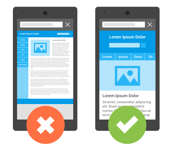
2. Streamline content
"The Mobile Playbook" sets a universal rule for mobile websites that goes:
The goal here is to tailor and rearrange content for specific audiences rather than removing it and offering a stripped-down version of your website.
But what do 'tailoring' and 'rearranging' actually mean when referred to content?
- Keep it simple,
- Get straight to the point,
- Eliminate unnecessary content,
- Provide the most important stuff at the beginning.
To prioritize content the right way, ask yourself again about your mobile website visitors' goals and how you are going to make them easier to achieve.
Take blogs for example. Big chunks of text that are readable on desktop (albeit with some rules that have to be followed) will not automatically look as good on a smartphone or tablet screen. They need to be streamlined.
How? Good practices for blogs include writing a TL;DR summary of an article and giving anchor links at the top of it to direct readers to their sections of interest. Remember that mobile users want what they seek here and now. If they want to read more, they just will.
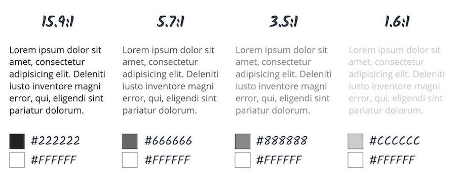
Readability also means that no part of your mobile website will require people to zoom.
You should also take notice of the contrast between the background and the copy of your page. For the fully pleasant mobile experience, Google recommends the contrast ratio of 4.5:1 for all text except for a very large one.
3. Build responsive mobile websites
Responsive web design (RWD) allows you to build a single website layout that changes dynamically depending on the type of device you are viewing it.
Today, you can use templates and landing page editors that automatically create a mobile-responsive version of your website. There's no need to build several separate websites for different kinds of screens.
The <viewport> meta tag usage is one of the principles of responsive web design. Without <viewport>, mobile devices render pages at typical desktop widths, and next scale the pages to fit the mobile screens. When set properly, <viewport> enables you to control the width and scaling of your mobile website.
To make it work, add it to the <head> of your HTML.
4. Optimize your images
According to Google, images take even up to 60% bytes needed to load a page. Mobile users don't like waiting for the site to load.
The bigger the image size, the longer it will take to load the page on a mobile device. Which in turn will have a negative impact on the user experience and Google search rankings of your webpage.
Depending on the type of an image and its role on your mobile website, use proper image formats. Use .png files (uncompressed format) only for logos and transparent pictures. For the rest of the content, apply the .jpg format (compressed) as this one allows you to balance the quality and size of a picture.
To save your visitors the long loading time irritation, resize and compress images for your mobile website.
Using various size versions of an image for display is a good practice. For example, you can store two versions of user avatar pictures - one sized 600x600 px for display in user edit page and the other sized 100x100 px to be viewed as an icon thumbnail in a navigation bar.
To provide various sized for multiple display scenarios, use the <source> tags and one <img> tag. The browser will use the first <source> file that fills its viewport and ignore the rest. In case no <source> file fits it, the browser will use the <img> element.
Relative sizes are yet another solution for images. By relatively specifying image width (for example width: 50%), you will prevent it from overflowing the containing element.
5. Set the right touch targets
Ever happened to click on a different link than you thought you were clicking on your touchscreen? Don't let the same happen to your mobile website's users.
Smartphone touchscreens offer much less precision than mouse pointers and keyboards.
Take it into account when designing interactive elements of your mobile website, such as buttons or links. Make sure:
- they are large enough,
- have enough space around them,
- are easy to press
to prevent your visitors from going nuts and tapping endlessly on the screen or accidentally pressing unwanted elements.
Shoot the right touch target for a nice experience.
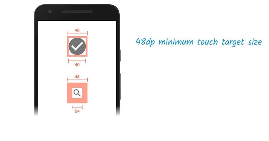
Google recommends 48 pixels in width and height as an optimum touch target for buttons. 48 pixels equals to circa 9 mm, which in turn is... yes, you guessed it, about the size of a person's finger pad.
To avoid overlapping with other interactive elements, set the touch targets 8 pixels apart.
6. Simplify forms
Filling forms on a 4" touchscreen can literally drive one crazy. We've all been there and it sometimes feels worse than the deepest circle of hell. Exhausted thumbs, missed fields, frustration rising.
Spare your visitors this torment by:
- Reducing the number of form fields - think if you really need all the data you ask for to achieve your business goal and then make necessary cuts. Do you need your visitor's second name or date of birth?
- Breaking the forms into several steps - first, for the sake of better UX. Dividing the typing process into several stages makes your clients feel like they're getting closer to their goal and saves them frustration. Second, even if they abandon the whole process halfway through, you at least end up with their e-mail you can reach them through later on.
7. Eliminate popups
There is hardly anything more irritating than clicking on a link and being detracted by a popup. This speaks for itself: popups lower the overall user experience and make access to desired content more difficult.
This is why in 2017 Google established a penalty for the sites where content is not easily accessible to a user because of 'intrusive interstitials' (or, generally, popups), by decreasing their search rankings.
Want your website to be mobile-friendly? Just don't use popups.

Take away
How to make a website mobile friendly?
If you own a business, you may be torn between choosing a mobile app or a mobile-optimized website.
A mobile-friendly website is a solution for a much wider audience. Working on it, you definitely should:
- Get into the shoes of your users, think of goals they want to achieve on your website and how you want to make the whole thing easier for them.
- Limit the number of links in your menu or use the popular hamburger navigation to make your visitors move easily on your website. To improve navigation on mobile devices, make sure you are using proper touch targets.
- Keep your content simple, readable and informative in the first place. To make information more accessible, provide your readers TL;DR summaries and anchor links.
- Reduce your mobile website's loading time with resized and compressed images, as well as setting the viewport meta tags.
- Make the user experience excellent by simplifying forms and avoiding distractions such as popups.
Thinking of improving the mobile presence of your business? Awesome. Email us, we want to learn more about it!
Top picture by Kuba Bakalarczyk based on a photo by Charles/Unsplash.com